This is another assignment from last year. We were asked to observe the texture and pattern of a wooden block and superimpose it onto a cuboid on paper. This was what I did (click to enlarge):


Well, this doesn't really look anything special, but it was quite a feat for me last year to be able to draw this. I wasn't the sort of person who would draw in their free time - even if I did, they were all 2D sketches of nonexistent, weird creatures. So, when we were asked to draw this, I was kind of nervous about how it'd turn out.

I managed to draw the above, which, thankfully, turned out looking okay. However, I think the cuboid could have been better drawn to look more realistic.

Still, drawing is a skill that comes with practice, and I did improve as the year went by. I got much better at drawing textures. Hopefully, I will be able to make similar progress for other aspects of drawing.

LSC Shirt Design

One of the first assignments we were given last year - probably the very first assignment, in fact - was to create a design for the Lifeskills Camp Shirt. Every year, in fact, we'd be asked to create a design for the event's shirt.

We were required to create a design which reflected the themes of "Self-Discovery" and the camp we would be going to, the Outward Bound School.

(click to enlarge images)

The initial sketch of my final design was like this:


Then it turned into this:


I don't feel that this is a particularly good design, but I did put in quite a lot of effort to do it, so I am quite satisfied with what I managed to come up with in the end. However, it's not exactly a very interesting idea, so I should try to come up with better concepts for such designs.

Well, also judging by this year's shirt logo design, I guess doing designs for such shirts isn't exactly my thing.

Usagi

An Usagi sketch I did last year:

Doodles

Below are some doodles I found from last year. At that time, I had a little obsession over those color-pencil-like-crayons, so... I had an Usagi doodling spree.

My Art teacher'd asked, "Are the bunnies your trademark?" Well, no, they aren't. I call them "Usagi"s, but they're actually LOVE-chan, a bunny character created by Ai Otsuka, one of my favourite singers.

I know these drawings are all quite lame and, for lack of a better word, stupid, but...


...This is kind of embarrassing.

月と太陽 (Moon and Sun)


(click on image to enlarge)

This work is a collaboration between me and another fellow classmate. We decided to combine our abstract assignments in this manner to create a new piece.

The picture I used was an abstract drawing (can be found in previous post Sunflower Abstracts) I'd done previously, of a sunflower field. The one that she chose was a drawing of a peony. The two flowers are really different. One, like the sun, stood tall, bright and cheerful. On the other hand, the other had an ethereal beauty which seemed to cause it to almost glow in the dark, under the moonlight.

That was how the concept for this piece was developed, and I'm glad that we did a great job in completing this work.

Sunflower Abstracts

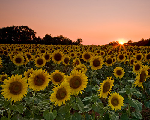
For this work, we were asked to find a picture, and do abstract drawings based on it. This is the picture I chose:


Below are the some of the abstract drawings I did (click on images to enlarge):


This was the very first drawing I did. It was also my first attempt at drawing an abstract of something, and I didn't do too badly, I suppose.


I like the one below, because it's quite different from what I usually draw. I like to use bright colours and seldom do completely black and white pictures, unless it's required of me.

So, doing this particular drawing was a new experience. It was also meant to look symmetrical and very precise, so I had quite a hard time drawing it freehand.


The last drawing, above, is one that I have a particularly deep impression of, because it's actually one of the last drawings I did. I was desperate to get my homework done, so I just sort of rushed this out.

After drawing these, I decided that I preferred abstract and more illustrative sorts of art rather than realism. This probably laid the groundwork for the decisions I made for my assignments later on.

After Dark

For the Art EOYs last year, we were given a set of themes we could choose from to base our final work on. The one I chose was "After Dark", and this was what I did for my final piece.

I was inspired by M.C. Escher's Other World, on which I based the setting of the work.

So, without further ado, meet our little friends the (sometimes often decapitated) custard buns:


(Click here to view an enlarged image of this)

Doesn't look like it has anything to do with "After Dark" whatsoever, does this?

In actual fact, the concept on which I based this work is that of dreams - the dreams people have after dark. This work basically tries to show the craziness, and basically unrealism of the dreams we have.

Plus a little bit of sadism.

The interesting thing about this work, I feel, is the fact that it doesn't look special at first glance. It's only after one looks at it for a while - and notices the little details - that it starts to get interesting. Many things are happening in the whole piece, and it's not really easy to spot them, but once one does, the whole work somehow seem to come alive.

Trying to add in all these little details was what made the work so enjoyable to create. I had a lot of fun watching people's reactions after they looked a little closer at it. I suppose that's one of the kicks out of making a work like that.

Although it was fun, this work was by no means easy to create. It was the first time I worked with watercolour, and the illustration style. Still, and thank goodness, the final piece didn't turn out badly.

These are the initial sketches I made of the custard bun character:

What's this whole "custard bun" thing? Here's a sketch of the actual bun:


A custard bun's an actual dessert, which falls under the dim sum category. It's delicious, extremely unhealthy, and, for first-timers, often consumed with entertaining results (involving custard spilling out in a fairly violent fashion).

Then, more sketches of the character in now various states of decapitation, this time done in marker:


Why decapitation? To tell the truth, I don't know. Somehow, when my brain got the idea that these buns could bleed custard, it told me to start murdering them.

Then I made some sketches of the moon I was planning to use in the setting:


I had a lot of fun with this, too. However, these drawings were done with watercolour and marker. It was the first time I worked with watercolour, but I didn't have much difficulty painting these drawings because they were pretty small.

Then came the actual setting designs:


(Click here to view an enlarged image of this)


(Click here to view and enlarged image of this)


(Click here to view an enlarged image of this)

These are the scenes that are happening out of the "windows" depicted in the final piece. There's another drawing I made of the shadow on the wall, also used in the final piece:


I had quite a lot of difficulty doing these. I wasn't used to using watercolour, and the first time I actually used it properly was to do the sketches of the moon. I couldn't control it properly, didn't know how it was supposed to look, and it took a few tries for me to get the right feel.

Thankfully, in the end, I managed to get the hang of it.

Below are sketches of the bed I used in the centre of the final piece:


These sketches are actually the very, very first ones I made in this illustration style for the whole work. I didn't purposely learn how to draw in this way. I'd just seen comics with this sort of shading and style, and decided one night to try it out...

And it worked.

More sketches:

After all that hard work, in the final days of preparation for the exam, I came up with this:


(Click here to view an enlarged image of this)